Theme
Case Study Access
This case study is password protected.
Access is restricted due to client confidentiality. Enter the password below or request access.
Password
Incorrect password. To request access, contact design@stephenzerne.com
Don't have the password? Request access — responses typically within one business day.
← Back to Work
Case Study — 02

Healthcare
Workforce
Planning

Enterprise Predictive Scheduling & Analytics · Lead UX
3 UX + 4 UI
Designers led as UX lead
25–150
Facilities per client organization
Multi-horizon
Hourly through annual planning
Client — Flexwise via MojoMedia
Year — 2021–2022
Role — Lead UX · Team of 3 UX + 4 UI Designers
Platform — Web Application · Enterprise SaaS
Lead UX Product Rethink Design Team Leadership Enterprise Healthcare Multi-Role System
Detailed workflows and system artifacts are restricted due to client confidentiality.
A product rethink for an existing enterprise platform — new features, redesigned existing ones, and a design team to lead through both.

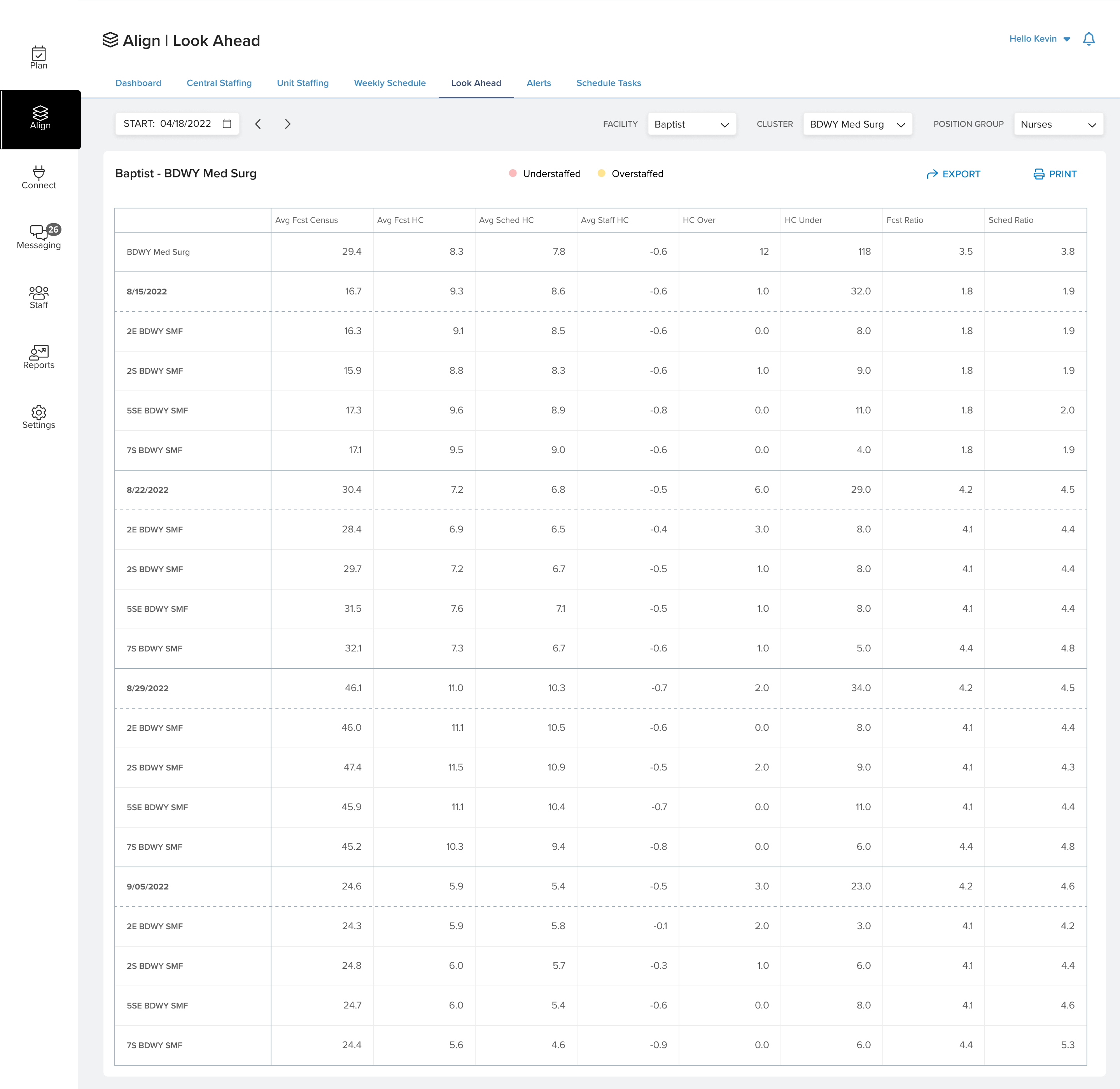
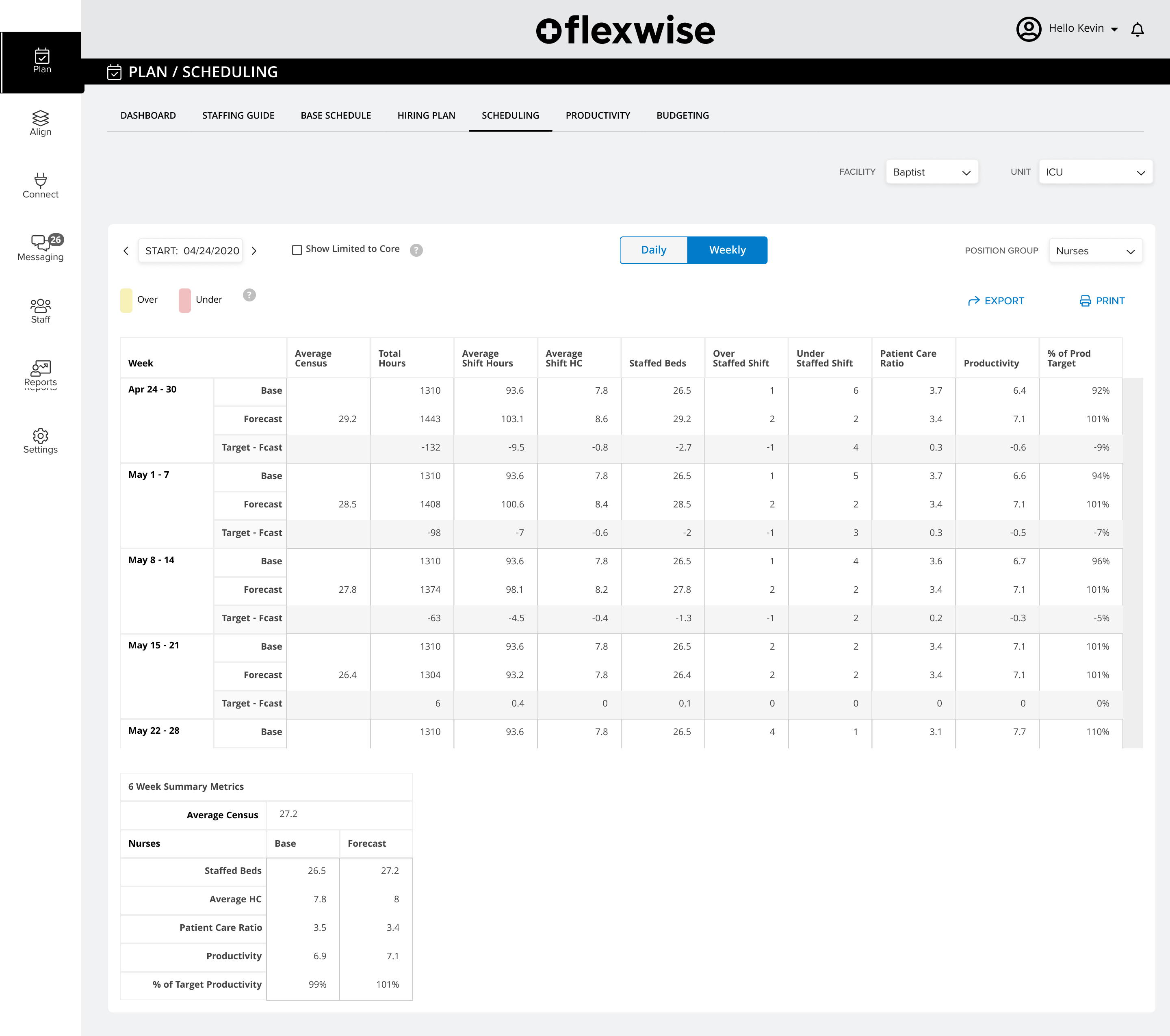
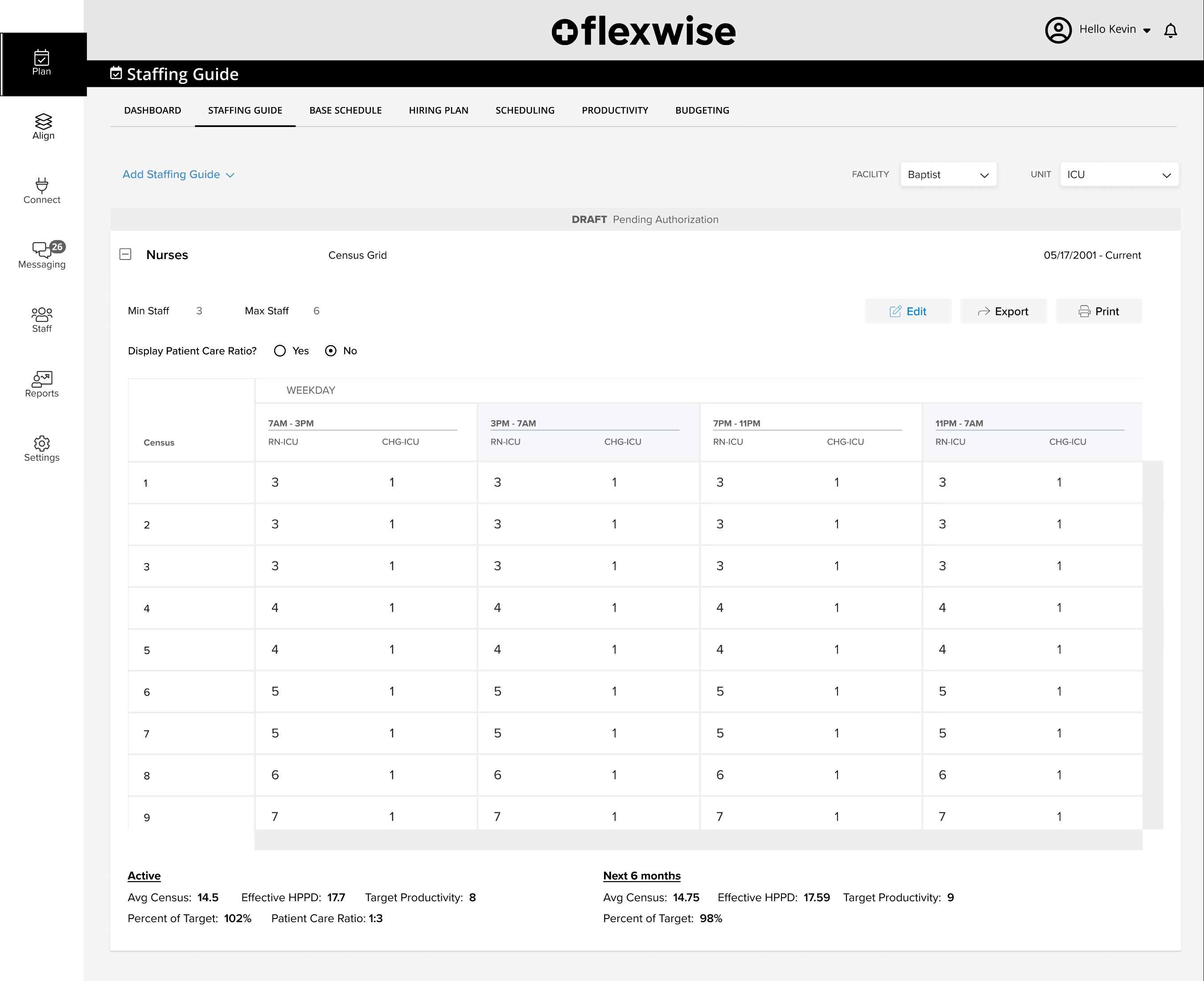
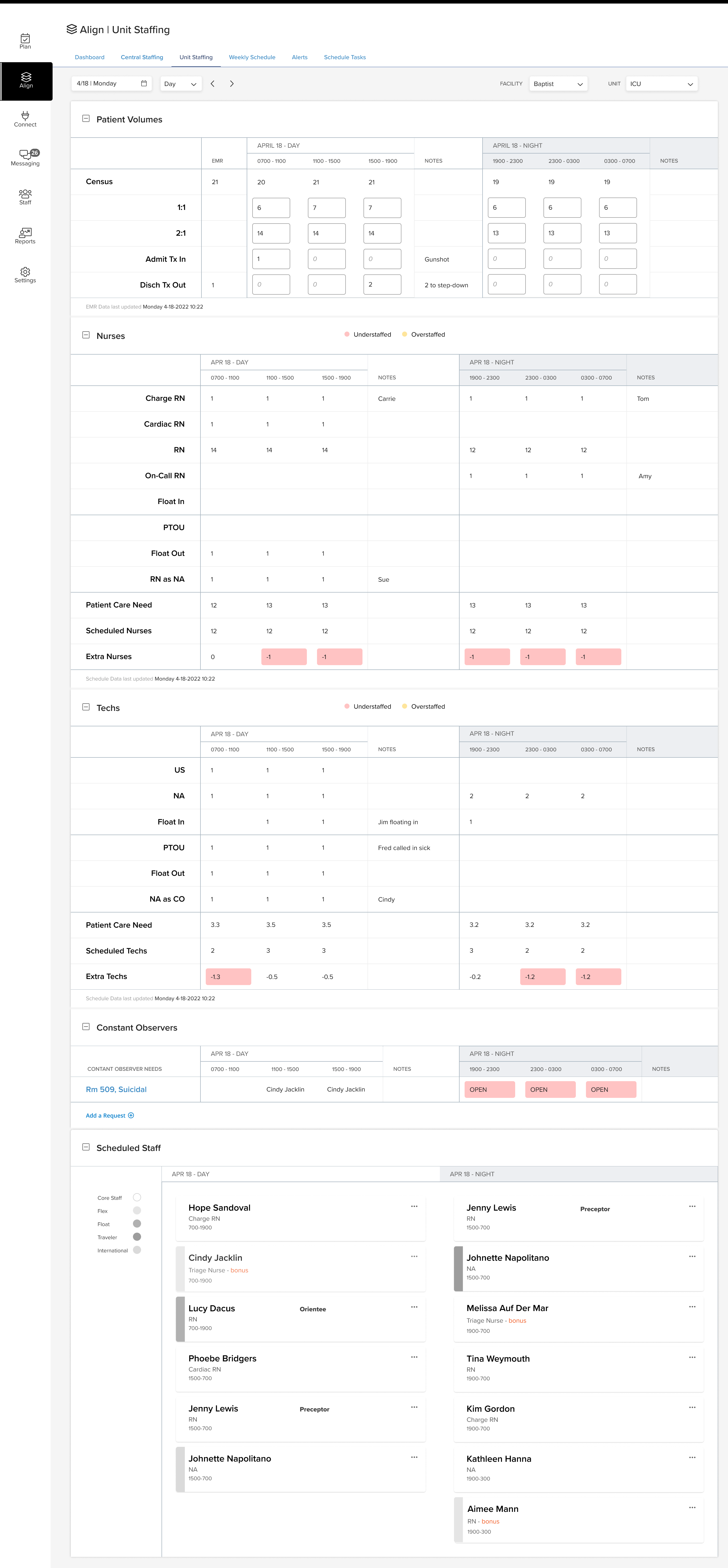
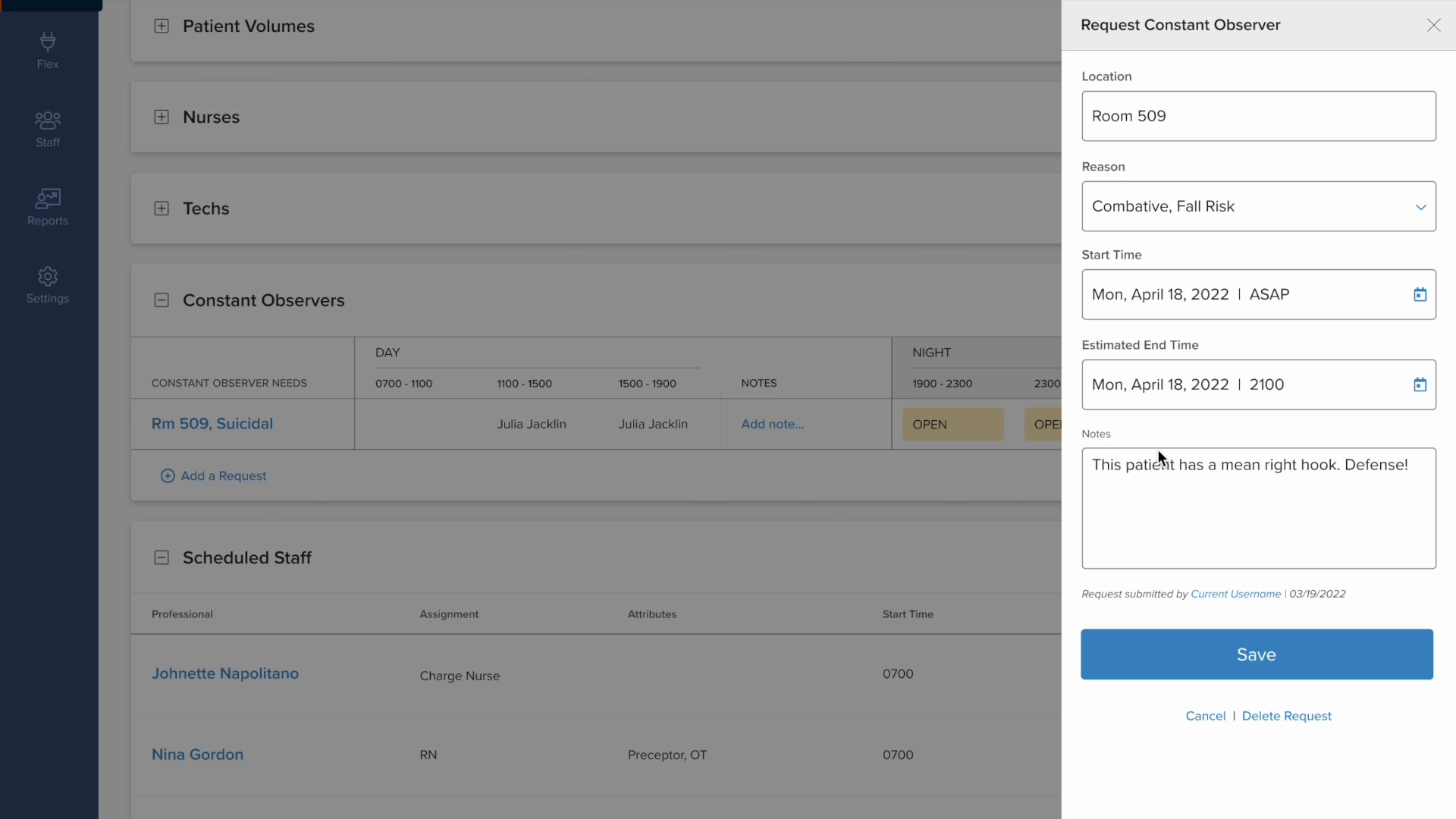
Flexwise was an existing healthcare workforce planning product with limited features and an established but underdeveloped framework. The engagement was a full rethink, with new features designed from scratch, existing features redesigned, and all of it held together within a consistent system language.

I led UX alongside an assistant UX and one additional UX designer, working with a team of four UI designers. My role sat upstream of execution: defining interaction architecture, writing feature definitions and experience documentation, guiding token and component structure to enable reusable animations and consistent patterns, and participating in client sessions to understand where the existing product was failing the people using it.

The platform served both executive decision-makers and operational planners across large hospital chains. These were organizations running 25–150 facilities, with 50–150 users per hospital. The user base numbered in the hundreds. The product was sold shortly after my contract concluded.


Flexwise Look Ahead
Flexwise — look ahead, multi-facility staffing forecast
Flexwise Scheduling
Flexwise — weekly scheduling
Flexwise Staffing Guide
Flexwise — staffing guide
Flexwise Unit Staffing
Flexwise — unit staffing. Plan’s predictive scaffolding, rendered as action.
Flexwise Constant Observer
Flexwise — constant observer panel

01
Challenge
Existing framework, limited room to diverge
The product had an established structure. New and redesigned features had to coexist within it without fracturing a live system already in use. The timeline was constrained, the team was at different stages of readiness, and the work had to hold together regardless.
Response
Experience leading product design at TDOT provided a framework for working within complex systems and weeding out bad ideas early. Spent the majority of time working directly with the client lead, combing through hospital requirements, feature ideas, and data sheets together. The structure evolved through several pivots as the work developed. MVP thinking had to be actively argued for. The instinct was to build everything at once; the value of starting with something that works, with a plan for more, had to be demonstrated repeatedly. Built token and component governance so the team could work at scale without fracturing the existing system.
Result
Cohesive system language maintained across the full role spectrum within an existing product framework. Each pivot made the product more focused, not more complicated. Ayumi joined late as secondary UX lead and contributed immediately, helping write acceptance criteria at a critical stage. The assistant UX brought genuine commitment through a steep learning curve. The lead UI developed deeper Figma proficiency mid-project, specifically around tokenization strategies, asset building, and managing interactive components. The team held together and delivered consistent UI output across a four-person team under a constrained timeline.
02
Challenge
High data density, non-negotiable
Multidimensional staffing data across roles, facilities, cost, compliance, and time horizons couldn't be simplified without losing clinical and operational relevance. The challenge wasn't just consuming that density. It also meant translating it to another UX designer mid-project so work could continue without a full restart.
Response
The principle was that users should only see the information required to make the decision in front of them, but getting there meant understanding all of it first. Sat with the data, worked through the algorithms, and identified what could be hidden without removing the ability to reason clearly. Knowledge transfer was a continuous part of the process: the client lead brought deep domain expertise, and translating that into interaction logic the development team could act on required moving fluidly between clinical reasoning and design language. Administrative setup for the analytical models was a significant design challenge, a handful of models people rely on for planning, each needing to work for different user types. Borrowed from existing planning models where possible and reduced further when the criteria allowed, keeping the cognitive load down. Steps and screens that started dense got reduced significantly through the process.
Result
Transferring domain knowledge to the secondary UX mid-project allowed UI production to ramp up and dev handoff to run cleanly, with almost no back-and-forth on how features should behave. Delivered a practical, usable set of planning, scheduling, and annual review features that supported the company goals and made staffing decisions more dependable across large hospital chains. Replaced spreadsheet-dependent workflows with a unified analytical system. Screens were reduced to the decisions they were actually serving. Executive forecasters and operational specialists served within a single coherent system.
03
Challenge
A spectrum of roles, one system
The platform served everyone from the chief nursing officer and director of nursing down to unit managers, charge nurses, and staff nurses, each with different authority levels, data literacy, and decisions to make. One product had to work across that entire range without collapsing into the lowest common denominator.
Response
As a contractor, the position in client meetings was deliberately quiet. Taking notes, observing, and passing findings to the client lead in follow-ups where he could confirm and explore without it becoming a contractor overstepping. Criteria emerged from those conversations: a charge nurse and a director of nursing sometimes needed the same information in the same format. Finding that required listening before designing. Feature definition written upstream gave the development team acceptance language and gave the design team a shared reference before a single screen was drawn.
Result
Feature definition documentation functioned as developer acceptance criteria, reducing back-and-forth during implementation. Criteria that emerged from listening in client sessions, a charge nurse and a director of nursing needing the same information in the same format, shaped decisions that would have been easy to get wrong from a brief alone.
04
Challenge
Regulatory and patient safety stakes
Staffing decisions informed by the platform had real compliance and safety consequences. The system needed to earn trust, not just display data, and doing that as a contractor on a constrained timeline, without direct access to end users, required finding other ways in.
Response
Client sessions as research. Observing where existing features failed in practice before deciding what to fix. Ran user tests with nurses drawn from the relevant roles, occasionally someone from a client hospital, more often a broader spread over Zoom. They worked through Figma flows built to full fidelity but unconnected to live data or any real system. Seeing them call out similarities to the data they would review downstream in the app was a genuine validation moment, a confidence builder for the client lead and for the direction the product was taking. What the system needed to earn wasn't just accuracy. It needed to feel like it understood the work.
Result
Features that didn't serve real clinical decision-making were cut or rethought, informed by what was actually observed, not assumed. Critical roles can be called in quickly through a clear access path for specialists and certified care. Flex roles are easily adjusted and filled by nurses already on duty. The platform was considered complete and market-ready. The product sold shortly after the contract concluded, which is the kind of result that doesn't need a footnote.